Where should eyes land the moment someone enters your room—on a view, a fireplace, or a piece of art that tells your story?
A strong focal artwork does more than decorate; it organizes the space, sets the mood, and quietly guides every other design choice. Here’s how to pick, place, and light art so it truly leads.
Why Focal
A focal point reduces visual noise and gives a room purpose. When art anchors the composition, furniture placement, color accents, and lighting fall into line. The result is cohesion: clearer sightlines, calmer decision-making, and a space that feels intentional rather than improvised.
Pick Pieces
Begin with feeling and function. For rooms meant to restore, choose calm subjects, abstract atmospheres, or soft landscapes. For lively spaces, try bolder gestures or graphic forms. Favor a personal connection over trend—pieces that evoke memory or meaning remain compelling long after novelty fades.
Right Scale
Size is the most common mistake. As a rule, above a sofa choose a work (or grouped works) about two-thirds the width of the seating. On large walls, go big or go multi: one substantial piece, a balanced diptych, or a three-panel triptych. Small art can disappear; sets should read as one visual unit.
Smart Placement
Hang centerlines around eye level—about 145–150 cm from the floor (57–60 inches). Above furniture, keep 15–25 cm between the top of the piece and the item below to maintain a visual “breath.” Align with obvious sightlines: the first wall seen from the entry, over a mantel, or at the end of a hallway.
Gallery Walls
Groupings make dramatic focal points when curated with intent. Choose an anchor piece, then build around it with consistent spacing of 5–8 cm between frames. Map the layout on the floor or with paper templates before you drill. Keep edges loosely rectangular so the ensemble reads orderly, not chaotic.
Light Well
Great art deserves great light. Aim fixtures at roughly 30° to the wall to minimize glare and shadows. Choose warm, color-true bulbs (CRI 90+, 2700–3000K) so tones remain accurate day and night. Avoid direct sun; add UV-filter glazing for delicate works. Picture lights, adjustable spots, or low-glare tracks all work—just keep intensity even across the piece.
Frame Choices
Frames are part of the composition. Thin black or satin brass lines modernize; warm wood calms and adds depth. Use archival mats (acid-free) with generous borders—typically 5–8 cm—to give works on paper room to breathe. Opt for museum glass for clarity and reduced reflection; acrylic is lighter for large pieces.
Color Echo
Let the artwork’s palette steer the room. Pull two or three hues into pillows, throws, a rug border, or a vase to tie the scheme together. A simple 60/30/10 ratio helps: one dominant neutral, a supporting color echoed from the piece, and a small, repeated accent for snap.
Style Sync
Marry the art’s character with the room’s language—or create deliberate tension. A classical oil feels fresh on a clean, modern wall; a bold contemporary canvas can energize traditional millwork. The key is consistency in a few details: frame finish, metal accents, and one repeated motif to stitch eras together.
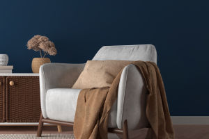
Balance Room
Consider visual weight. A dark, dense canvas needs grounding furniture beneath; a light, airy piece can sit over slimmer forms. Symmetry reads calm—flank the art with paired sconces or chairs. Asymmetry reads dynamic—offset the work with a single floor lamp and a low stack of books to counterbalance.
Use Architecture
Niches, alcoves, and paneled fields make natural stages. Paint the recess slightly darker to “theater-box” the art, or run a textured wallcovering behind for subtle depth. In long rooms, place a strong piece at the terminus to pull people forward and improve circulation.
Material Harmony
Echo the artwork’s texture in the room. A canvas with visible brushwork pairs well with nubby textiles and matte ceramics. Photographic gloss likes crisp metals and glass. Sculpture asks for negative space—keep surrounding surfaces quiet and let light skim edges to reveal form.
Expert Tips
Gallery curators often recommend maintaining consistent eye-level hanging throughout a home to create visual rhythm and continuity from room to room. Conservation framers advise using archival mats and acid-free backings to protect works on paper over time. Lighting designers favor beam spreads that softly vignette the artwork rather than produce a harsh oval of light.
Environmental psychology research further supports these principles: clear visual focal points and balanced lighting reduce cognitive load, enhancing calmness and spatial orientation (Kaplan & Kaplan, 1989; Ulrich, 1984; Bitner, 1992).
Advanced Moves
Mirror the art strategically to double impact and brighten a dim corner—just avoid facing direct windows. For media walls, float art adjacent to the screen at equal visual weight so the black rectangle doesn’t dominate. In open plans, repeat the artwork’s accent color at distant touchpoints to link zones.
Avoid These
Don’t hang too high, don’t go too small, and don’t flood art with harsh, cool light. Avoid mixing clashing frame styles in a single grouping. Skip busy décor inches from the piece; give the focal point “air” so it can carry the room without competition.
Quick Checklist
Test scale with painter’s tape.
Mark a 145–150 cm centerline for hanging.
Choose CRI 90+ warm lamps and a 30° aim.
Repeat two colors from the art elsewhere.
Use archival mats and low-glare glazing.
Photograph the wall plan before you commit.
Conclusion
A room feels finished when one artwork leads and everything else harmonizes around it—placement clear, lighting gentle, color echoed with intention. Start with the piece that moves you, right-size it to the wall, and let frames, light, and decor amplify the story. Which wall in your home is ready to become a true focal point—and what art would you love to see there first?