Flower arranging is an art that blends creativity with visual science.
One of the most powerful tools a floral designer has is color harmony — the ability to pair hues so they enhance each other and create a visually compelling bouquet or centerpiece.
Understanding how colors relate on the wheel can transform your designs from ordinary to outstanding.
Understanding the Color Wheel
At the heart of color harmony is the color wheel — a circular diagram of hues that shows how they connect and contrast. Designers often refer to this wheel to guide their choices in floral design.
Analogous Colors
These are groups of colors that sit next to each other on the color wheel, such as yellow, yellow orange, and orange. Because they share a visual family, they create a naturally harmonious and soothing look in arrangements. Ideal for soft, romantic themes.
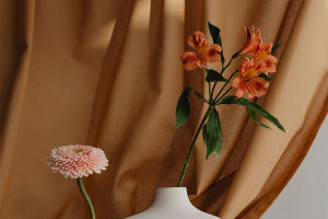
Complementary Colors
Positioned directly opposite each other, such as purple and yellow or blue and orange, complementary colors generate high contrast and visual impact. These combinations draw the eye and can make elements of your floral design “pop,” but they need careful balance so the colors don't compete too aggressively.
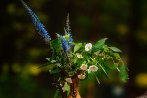
Triadic Schemes
A set of three colors evenly spaced around the wheel — for example, red, yellow, and blue — offers a vibrant yet balanced harmony. Florists often use one dominant hue and two accent colors to maintain cohesion without dullness.
Practical Floral Color Pairing Tips
Incorporating color theory into floral design has real effects on mood and appeal:
Start with a focal color
Choose a dominant flower or hue that sets the tone. For a high energy piece, pick a bright complementary contrast to that focal color. For a calming arrangement, select analogous hues that flow together.
Balance warm and cool tones
Warm colors (reds, oranges, yellows) tend to advance the eye and feel intimate, while cool tones (blues, greens, purples) recede and suggest calm. Combining these thoughtfully can make an arrangement feel dynamic yet harmonious.
Use tints and shades for depth
Variations of a single hue — adding white or gray — can create a gradient effect that deepens the look without adding stark contrasts.
4. Consider emotional context
Colors carry associations — yellow evokes joy, purple luxury, muted tones refinement. Pair these with complementary or analogous schemes to reinforce the intended mood.
Applying Color Harmony Creatively
Color harmony isn't rigid; it's a guide that supports your artistic vision. For example, a bold cafe centerpiece might employ a complementary palette of orange marigolds and blue delphiniums, while a bedroom arrangement might use analogous pinks and peaches for a restful feel.
Understanding how colors interact allows you to craft pieces that resonate visually and emotionally. Light, space, and foliage all influence perception — a color that sings in bright daylight may soften indoors, and leaves can bridge hues to unify the design.
Mastering color harmony not only improves aesthetics but also enriches the stories your floral works tell. Let the color wheel guide you toward harmony, depth, and lasting visual impact.